Angular gauge
- Deborah Pender (Unlicensed)
To use the Angular Gauge output, you must create a report that includes low, mid and high values.
Here is an example.
Create a transactions report.
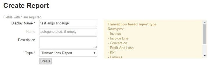
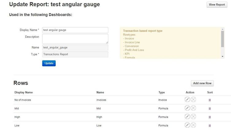
Add a row of what you want measured.
Eg. Invoices
Add three formula rows each with a value.
Eg Low 5000
Mid 8000
High 12000
Create a new Dashboard and add the report.
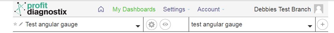
Once added, click the report settings button.
Change the output to Angular Gauge, and then click the config output type button next to it.
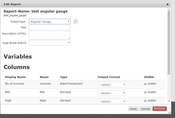
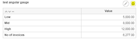
Once in the configure output screen, under Select Values, name the Gauge Title what you are going to measure, and select the corresponding row next to Needle.
Under Plotbands, select the rows you created - Low, Mid and High, and choose desired colour.
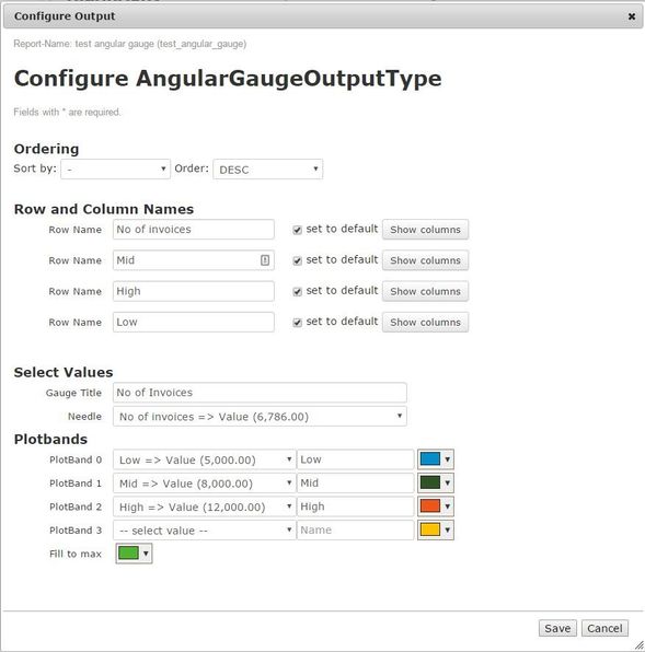
Click save, and the Angular Gauge will be displayed.
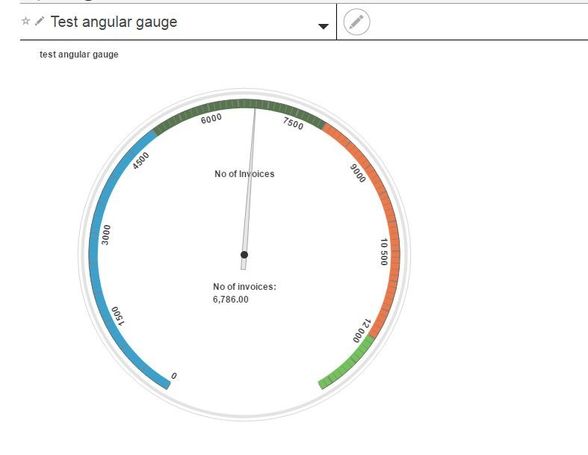
You will see the blue value goes up to 5000 (low), the green value goes to 8000 (mid), and the orange value goes up to 12000 (high).