Grouped by Dates Reports
Possible row types:
- Invoice: Collects data from the invoices table
- Invoice Line: Collects data from the invoice lines table
- Profit and Loss: Collects data from the ledger accounts imported from the bookkeeping software
- KPI: Collects data from "Manual Data Points" (time based static values) (see Settings > Manual Data Points)
- Formula: Use existing report variables or row results to calculate a value
A Grouped by Date Report can be reported by grouping a month, week, quarter or specified date range of data. For this example we’ll be using the ‘Month Report’.
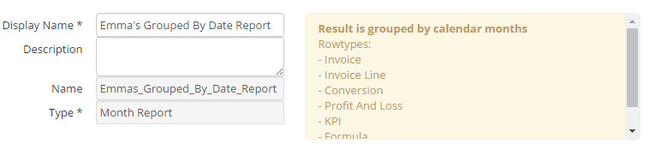
Start by going to Settings >> Reports >> Create Report
Display Name: e.g. Emma’s Grouped By Date Report
Type: Month Report
Click on CREATE.
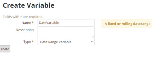
First we need to create a date variable to specify what months we want to see in our report. Do this by clicking on ‘Add Variable’ in the middle of your page.
Name: e.g. DateVariable
Type: Date Range Variable
Click on Create.
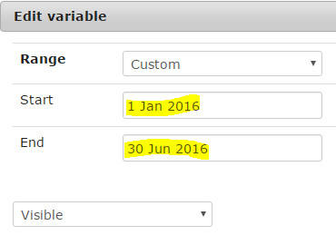
Once this is created you need to edit the variable to choose the months you want on your report. Click on the edit link on the variable:
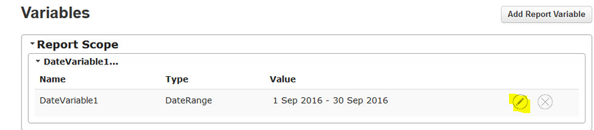
Choose a start and end date by hovering over and clicking through the months.
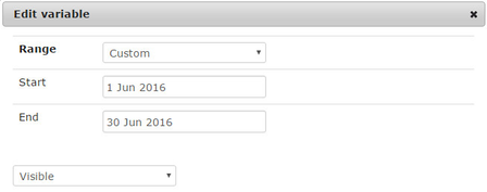
E.g. 1 January 2016 to 31 June 2016
Click on Save once you’ve chosen your desired dates.
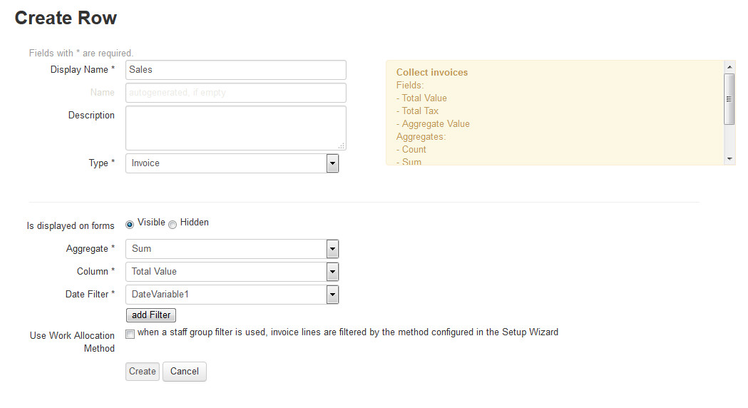
Now you need to create a row by clicking on ‘Add Row’.
Display Name: e.g. Sales
Type: Invoice
Aggregate: Sum (You are finding a total amount of sales for that date)
Column: Total Value
Date Filter: Scroll down to find your variable: DateVariable
Click on Create.
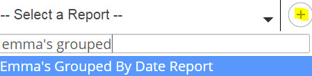
Now add the report to your dashboard by going to your desired dashboard, clicking on the pen tool, and searching for your report:
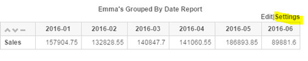
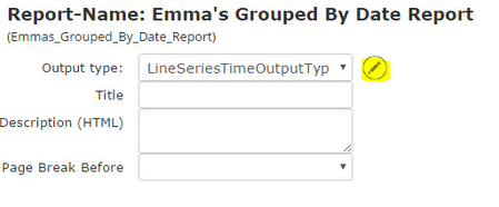
You can now see it on the dashboard as a table. You can keep it like this or pivot it into a line chart. Do this by clicking on settings at the top right corner for that report:
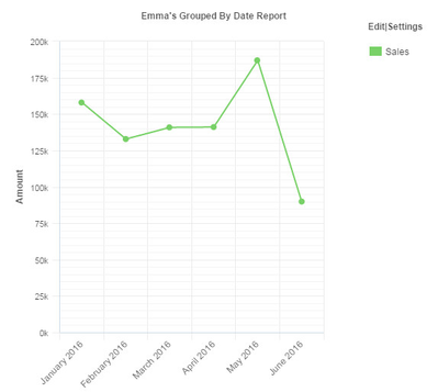
Change The Output Type to: LineSeriesTimeOutputType then click on Save.
If you want to change the names of the columns, go to Settings again in the top right hand corner of the report. Click on the pen tool next to the Output Type.
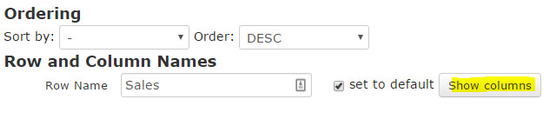
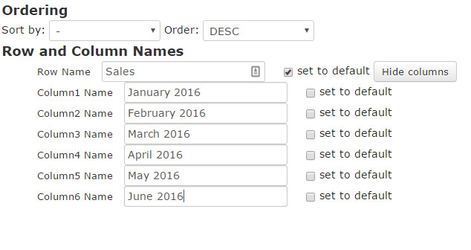
Click on the ‘Show Columns’ box and here you can edit each name.
If you want to revert the columns back to their original names then you can just tick the ‘Set to default’ box.
Click on save, and then save again to view the updated report on your dashboard.
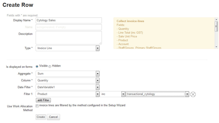
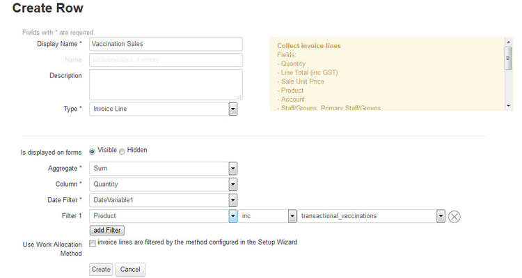
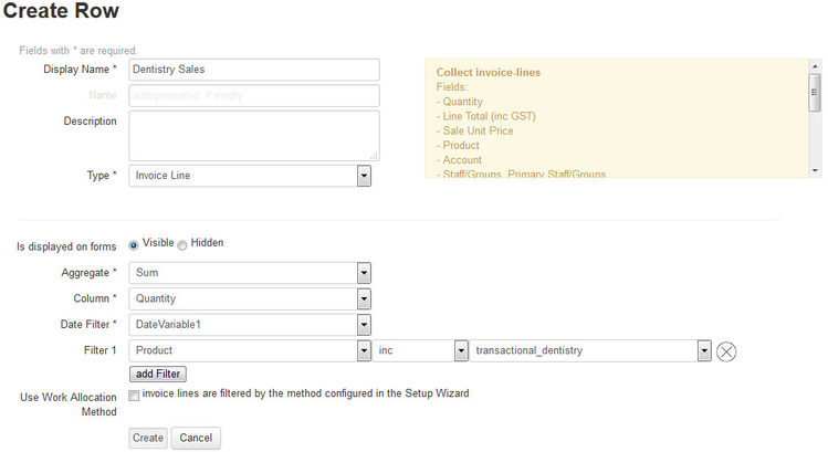
You may want to see what was included within these sales for the months you chose e.g. cytology, vaccinations or dentistry sales.
Create a separate row for each specific sale item you want to see.
E.g. Cytology:
E.g. Vaccinations:
E.g. Dentistry:
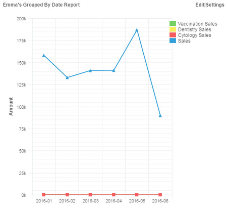
View your updated report on your dashboard now.
Because the specific products will have a lesser value per month than the total sales, they will not show through the line chart e.g.:
Change the report back to a table by going to settings as you did earlier, choosing TableOutputType or PivotTableOutputType from the Output Type drop down menu.
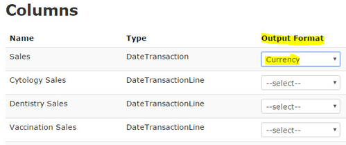
Because you can see the values now, you can change them to be dollar values rather than just plain numbers.
Go back to settings, scroll down to see all columns, and where you have the choice of ‘Output Format’ there is a drop down menu with ‘Integer’, ‘Float’ or ‘Currency’.
In this case we want currency. Once they’ve all been changed, click on save and view your updated report.
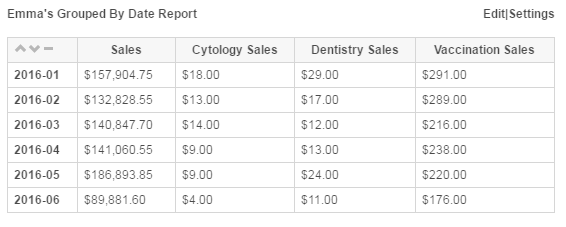
Your report will look something like this now:
This tutorial video shows how to create a dashboard and monthly report on the topic of desexing.